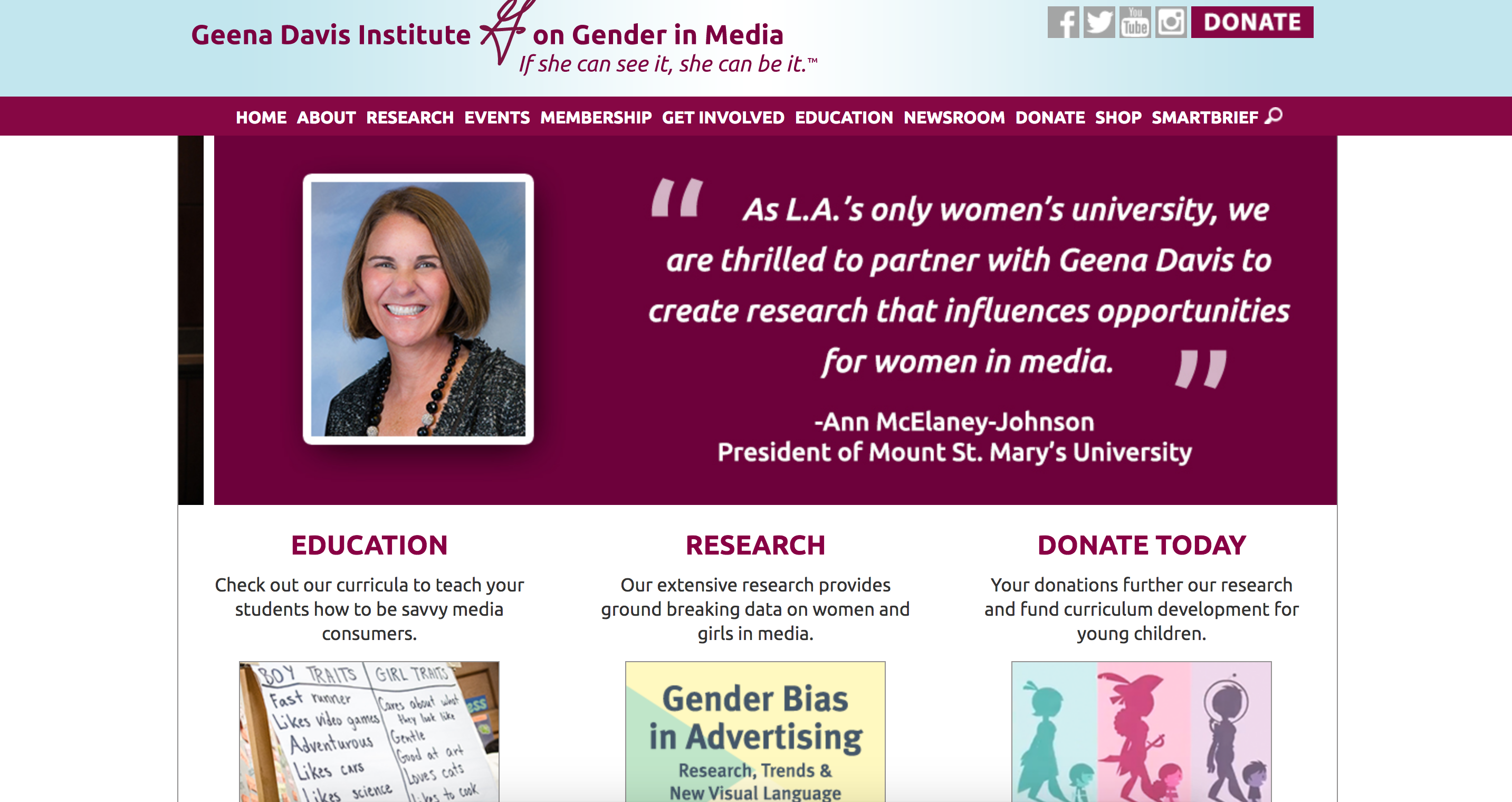
Upon inspection of the Geena Davis institute for gender in media page, I was perplexed by a bit of the UI. I suppose one of the more prevalent issues I have with the site is the horrific color scheme, as it features possibly the ugliest radial gradient ever, which does not play well with the deep fuchsia and mulberry tones featured in the nav bar.
That being said, the site is responsive, and it has a nice use of CSS rules on their divs, but I would have liked it if there was more affirmation from the site regarding where I was hovering my cursor. I also would prefer that they would put their logo in more places instead of their logotype, as it seriously weakens the overall page for its quality.
On the page where the new stories are located, for some reason, the page just ends instead of continuing on into a different set of stories, it just stops at the end of the page, leaving an uncomfortable amount of space between the footer and the end of the body of the page, which, I would declare to be an easy fix.
Another issue I have with the end of the page is that there is not a button that allows me to go back to the top of the page with a reference #. Instead, I have to scroll all the way up to the nav bar. This would not be such a big issue to me if the nav was sticky, and followed the scroll of the page instead.
The banner is a nice addition, but it does not allow me to click on any of the content on the page that is featured the most prominently, which I find really puzzling. Like, if you do not want me to click on it, why is it even on display? The graphic design choices are already strange enough, why would you make an album of terribly designed pieces that I cannot even access for the actual content?
At the top right of the page, there are social media links as well as a donate button, but none of the buttons are styled with a hover or a click function, so it leaves the user wondering if they had pressed it at all. I would also love it if there was more of a user friendly sense all in all, just because I think it is pretty frustrating as a UI designer and an audience member to not receive affirmation for hovering, clicking, and other options.

